What makes a photo convert well
A pattern is a picture made of a small grid and a limited number of colours. The photos that survive that simplification have:
- One clear subject that fills most of the frame.
- A plain or blurred background, or one you are happy to remove.
- Good, even light, without deep shadows across the subject or blown-out highlights.
- Strong contrast between the subject and its surroundings.
- Sharp focus on the important parts, especially the eyes in portraits.
What goes wrong, side by side
Here is one test photo, a red ball on a grassy hill, followed by the same picture with four common problems. Each went through the cross stitch pattern generator at the same settings, 80 stitches wide with up to 24 colours, and the chart on the right is exactly what came out.
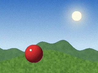
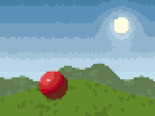 Good photoClear subject, six shades on the ball, strong contrast.
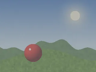
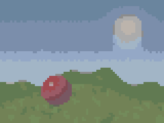 Flat, low contrastContrast between the ball and the grass falls by 23%; the picture turns muddy.
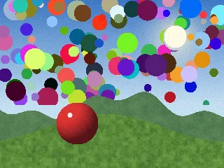
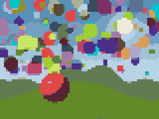 Busy backgroundThe background takes every colour slot; the ball keeps only 4 shades.
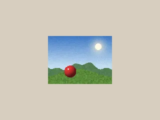
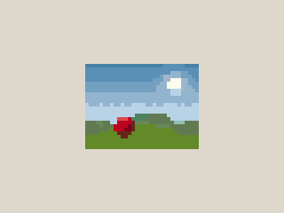 Subject too smallThe ball shrinks to 6 stitches across: a red blob.
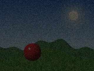
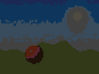 Dark and noisyOnly 10 colours in the whole chart, and half the contrast.
| Photo | Colours used | Ball width | Shades on the ball | Ball contrast (ΔE) | Stitchability |
|---|---|---|---|---|---|
| Good photo | 22 | 15 stitches | 6 | 53 | 85 |
| Flat, low contrast | 17 | 15 stitches | 6 | 40 | 87 |
| Busy background | 24 | 15 stitches | 4 | 54 | 90 |
| Subject too small | 17 | 6 stitches | 4 | 55 | 83 |
| Dark and noisy | 10 | 15 stitches | 4 | 26 | 92 |
“Shades on the ball” counts the different threads used inside the ball, which is what makes it look round instead of flat. “Ball contrast” is the CIEDE2000 colour difference between the ball and the grass round it: the higher, the more the subject stands out.
What the test shows
- Small subjects lose everything. With the scene at 40% size in a wide frame, the ball went from 15 stitches across to 6, and from 6 shades to 4. Cropping is the cheapest fix there is.
- Busy backgrounds steal colours. The generator picks the colours that best describe the whole picture, so a cluttered background claims palette slots the subject needed. The ball kept only 4 shades, even though the chart used the full 24 colours.
- Flat light means a muddy chart. At low contrast, the ball stood out about a quarter less from the grass, and the chart needed only 17 colours because everything had become similar.
- Dark photos are the worst. Underexposure plus noise halved the contrast and left only 10 colours in the whole chart.
- The stitchability score did not catch any of this. It measures how easy a chart is to stitch, so a muddy, low-colour chart scores well. Use the score to judge stitching effort, and your eyes to judge the picture.
Crop first, then convert
Cropping is the single most effective step. Cut away everything that is not the subject, so every stitch is spent where it matters. For a pet portrait, crop to the head and shoulders. For a landscape, decide what the picture is about, the tree, the house or the sky, and crop round it. The pattern makers have crop sliders under Advanced, so you do not need another app.
Fix the light before you convert
If a photo is dark or flat, brighten it and add a little contrast first, either in your phone’s photo editor or with the brightness, contrast and saturation sliders in the generator. Our test shows why: the dark photo lost half its contrast and most of its colours before any pattern settings came into play. Very noisy low-light photos also produce speckled charts; see confetti explained for how much noise adds.
Background: keep, simplify or remove
- Keep a simple background if it adds context, like a plain wall or sky.
- Simplify a busy one by cropping it out or blurring it in a photo editor before converting.
- Remove it for a cut-out look: use skip background to leave white or a chosen colour unstitched. On fabric, unstitched Aida becomes the background; for beads, empty pegs.
Size and colours by craft
The generator starts each craft at a sensible default. These are good starting points to adjust from:
| Craft | Generator default | Typical range | Colours to start with |
|---|---|---|---|
| Cross stitch portrait | 100 stitches, 24 colours | 100–150 stitches wide | 20–40 |
| Cross stitch simple graphic | 100 stitches, 24 colours | 40–80 stitches wide | 6–15 |
| Fuse beads | 58 beads, 16 colours | 29–58 beads (one or two 29-peg boards) | 8–20 |
| Diamond painting | 160 drills, 40 colours | 120–200 drills wide | 30–60 |
| Knitting colourwork | 60 stitches, 6 colours | 40–80 stitches wide | 2–6 |
| C2C crochet | 60 blocks, 8 colours | 50–120 blocks wide | 4–10 |
Start with fewer colours than you think and add more only where the picture needs them. Each extra colour is another skein or bag to buy and more colour changes. Our guide to choosing thread colours tests how many colours a design can really use at each size.
Cleaning up the result
After converting:
- Look at the realistic preview from a distance, the way the finished piece will be seen.
- Check the stitchability score and its tips for confetti and rare colours, remembering it rates effort, not looks.
- Merge colours that are almost the same. In the editor, select the colour you want to remove, press Merge, then click the colour it should become.
- Fix important details by hand in the editor, especially eyes, which often need a light highlight stitch and a crisp dark outline.
Photos to avoid, or to fix first
| Photo | Why it struggles | Fix |
|---|---|---|
| Dark or backlit | Few colours, little contrast, lots of noise | Brighten and add contrast before converting |
| Small subject in a big scene | Too few stitches for detail | Crop tight, or make the pattern larger |
| Busy background | Steals colours and adds confetti | Crop it out, blur it, or skip the background |
| Group photos | Each face ends up only a few stitches wide | Crop to one or two faces, or make it very large |
| Fine repeating patterns (stripes, tiles, knitwear) | The grid clashes with them and creates false patterns | Crop out or simplify by hand |
| Blurry or out of focus | Soft edges become blotchy bands of colour | Choose a sharper shot; focus matters most on the eyes |